Aurora Design system
Background
Problem Statement
Objective:
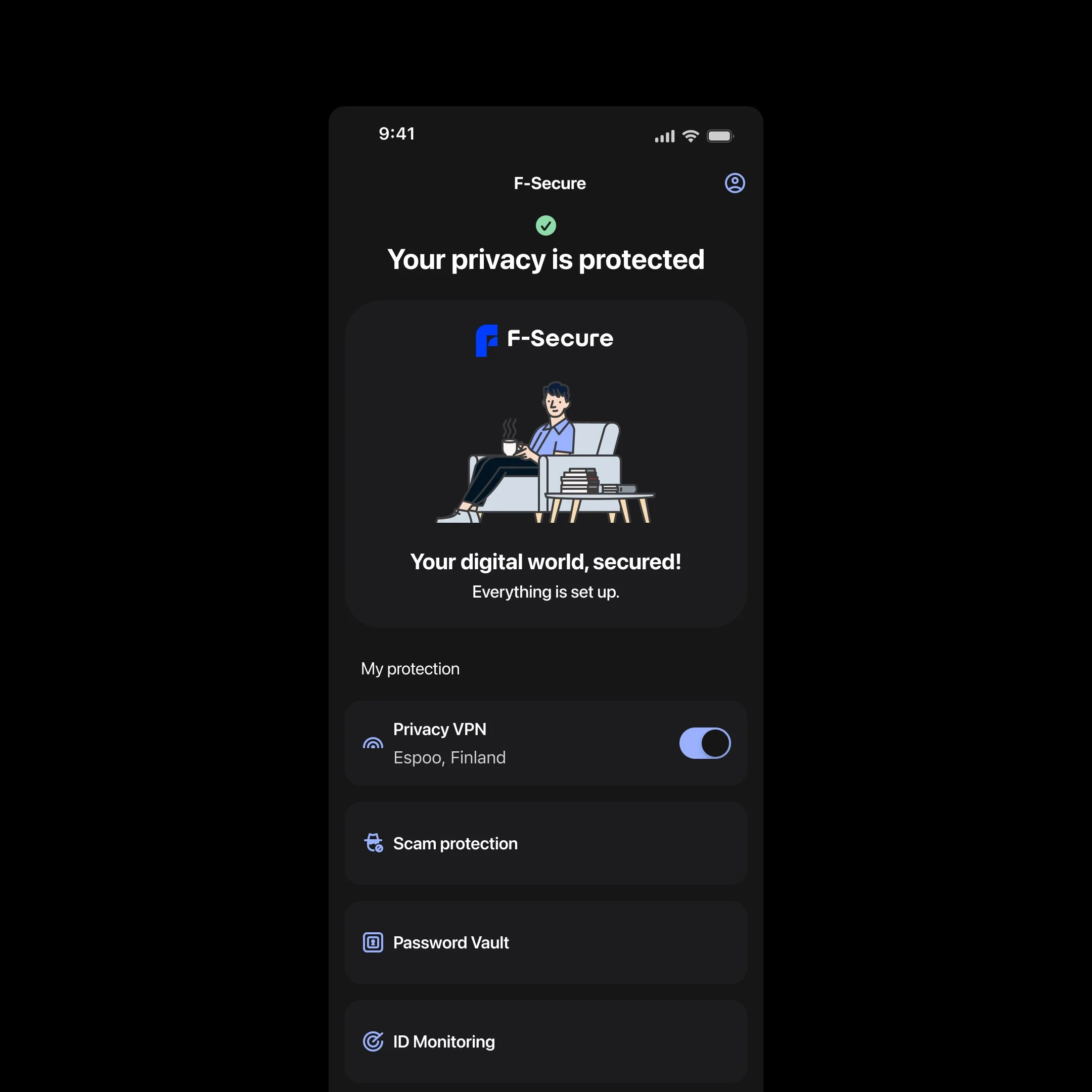
F-Secure, a leading cybersecurity company, recently underwent a comprehensive rebranding initiative. As part of this transformation, the company identified the need for a unified design system to bring consistency across its digital platforms. With a diverse portfolio of security products and a global presence, the lack of cohesion in design led to inefficiencies and an inconsistent user experience.
The absence of a unified design system led to:
Disjointed user experiences across platforms (mobile, desktop app, and web app).
Redundant design and development work, causing delays and increased costs.
Difficulty in onboarding new team members due to scattered resources.
Develop a scalable and cohesive design system, named "Aurora", to unify design and development efforts, improve user experience consistency, enhance collaboration across teams, and document the system in Supernova for clients’ usage.
My Role
Discovery Phase

-
Defining the visual language of Aurora, ensuring the alignment of typography, color palettes, and iconography with F-Secure’s rebranding efforts.
Ensured that all design components were visually cohesive and optimized for cross-platform consistency (mobile, desktop app, and web app).
Provided assets and guidelines to support both designers and developers in the implementation process.
-
Worked closely with UX researchers and developers to ensure seamless user journeys across platforms.
Contributed to the creation and refinement of interactive components within the design system.
Ensured prototypes and designs were accessible, functional, and visually aligned with F-Secure’s branding.
Conducted stakeholder interviews to understand pain points and goals.
Audited existing design assets, components, and codebases across products.
Identified key user personas and scenarios to align the design system with user needs.
Facilitated workshops involving consultants and developers to gather diverse perspectives and ensure alignment across technical and design objectives. We got an external consultant to help us in this phase


Foundation Building
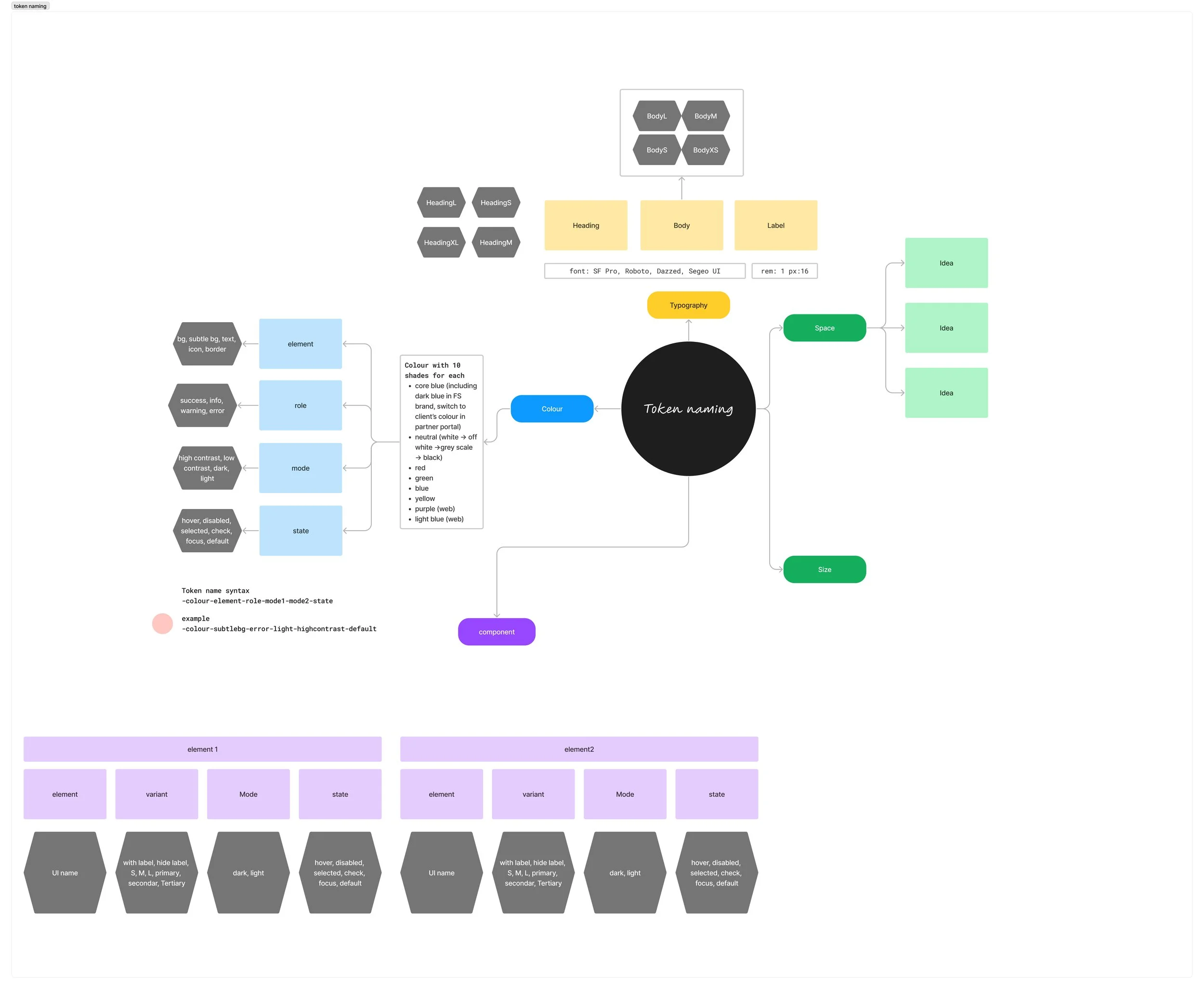
Typography tokens structure
Established design principles to guide the system (e.g., consistency, accessibility, scalability).
Defined a visual language, including typography, color palettes, and spacing guidelines.

Spacing tokens

Radius corner tokens
Colors semantic tokens (click to expand the full list)


Typography text style for several platforms, used typography tokens
Result
Component Library Creation:
Developed a library of modular, responsive components (e.g., buttons, forms, navigation menus).
Ensured components adhered to WCAG 2.1 accessibility standards.