Iittala - App design for enhancing Sales
Iittala - App design for enhancing Sales
Iittala is one of the most famous Finnish brands for producing tableware, kitchen utensils, and interior design object. Although the most well-known product of Iittala is Alvar Aalto’s vase collection, the philosophy of the brand is producing everyday objects with high-quality, long-lasting and iconic designs. I’m personally a fan of Iittala and interested in the brand itself, it somehow reflects Finnish history, along with the mindset of iconic designers such as Alvar Aalto, and Kaj Franck. For this project, my goal is studying about Iittala’s brand values and adapt those to design, research User Experience in E-commerce app, and practicing my prototype skills.
Introduction
Background Research and Process
Why E-commerce app?
The main digital channel of sale now is on Iittala’s webshop, some other channels also available on digital markets like Finnish Design shop where products are curated. The webshop can be accessed through smartphones but with a limited design. The problem caused by the website’s responsiveness is having some limitation on the product view, occur problems in finding products and product categorization. Especially with the categorization, I want to invest time to restructure information to enhance user’s experience when browsing.
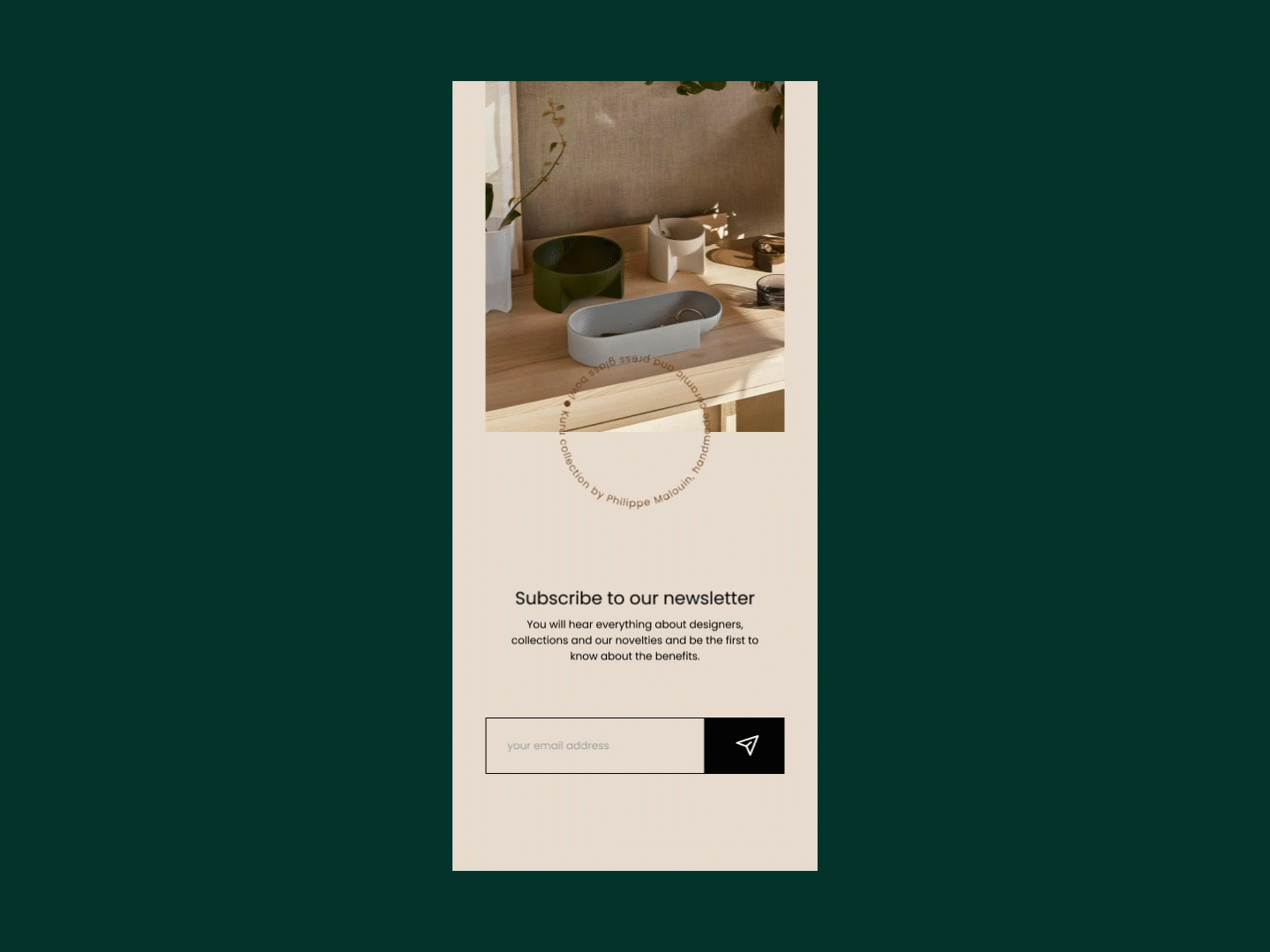
Furthermore, Iittla holds a long history in Finnish design, therefore there are plenty of loyal customers who need to keep updates, explore techniques or materials in making products, or study about Finnish design. An e-commerce app is a suitable platform that manages functions like that.
Objectives and Goals
Restructure information
Currently, Iittala has 2 main product lines based on functionality: interior decor objects and tableware/kitchen utensils. Otherwise, they also have plenty of collections grouped by designers, seasonal objects, and limited offers. Depending on customer desire, they can browse to find products. However, with the current design, it’s hard to follow their categorizations and choose the right tab to search. If customers don’t know the product name which is mainly in Finnish, the customer may give up and jump to another option.
Initial solution: the homepage content should highlight the categorized product in the following order:
Seasonal product collection and/or new arrival (on the main banner)
Call-to-action button
Search button
Category: Decor, Kitchen, other collection
Focus on the sales effectiveness:
In order to keep the effectiveness of sales, the interface has to be clean, parallel with the recognizable patterns. For example, some icons should be similar to other e-commerce pages like the cart or shipping icons. Otherwise, the checkout process should be fast and easy, with less confusing information.
Enhancing user experience with product page details on history and stories behind products
According to research by Nielsen Norman Group, customers tend to compare products, it can be product variants such as color, size, price, and so on. In Iittala case, the iconic items usually have a long history with specific information on who made it, how it was created, and the stories behind products. To include all those information on a single product page, I have to prioritize the order. It should be:
Product image carousel
Name and price
Designer
Quality
Call to action - Add to cart button
Color variants
Availability
Care instruction
Shipping cost
Recommendation for similar items
Designer story - bio or how it’s made
User flow and Wireframe
3 main flows:
Home page with clean interface about categories
Single product page
Check out